5 Network Visualization
In this tutorial we will cover network visualization in R. A researcher will often start an analysis by plotting the network(s) in question. In fact, one of the real benefits of a network approach is that there is a tight connection between the underlying data and the visualization of that data. We have already seen some basic plotting commands in our previous tutorials. Here, we will walk through the different approaches and options in detail. We note three things before we get started. First, it is important to remember that different plots are useful for different purposes. The kind of plot that is useful for an initial exploration of the network may be different than a more polished figure used in publication. Second, we will only cover a relatively small number of plotting options. More advanced options are available within and outside R (i.e., in programs like Pajek and Gephi). And third, we note that plotting options appropriate for one network (i.e., a small, face-to-face network) may not work for another (a large email-based network).
The tutorial is split into two parts. In the first part of the tutorial, we will use cross-sectional network data and cover basic network visualization. In the second part of the tutorial, we will use continuous-time network data, and cover visualization approaches (like network movies) appropriate for dynamic network data.
5.1 Setting up the Session
We will use the same network as in Chapter 3, Part 1 for the first part of this tutorial, on basic network visualization. The actors are students in a classroom and the relation of interest is friendship. There is individual information on gender, race and grade.
Let's go ahead and read in the network data, saved as an edgelist (the file is read in from a URL, defined in the first line below).
url1 <- "https://github.com/JeffreyAlanSmith/Integrated_Network_Science/raw/master/data/class555_edgelist.csv"

class_edges <- read.csv(file = url1)
Let's also read in the attribute file.
url2 <- "https://github.com/JeffreyAlanSmith/Integrated_Network_Science/raw/master/data/class555_attributedata.csv"

class_attributes <- read.csv(file = url2)
We will begin using the igraph package.
library(igraph)Now we go ahead and construct the igraph object, using the edgelist and attribute objects as inputs.
class_net <- graph_from_data_frame(d = class_edges, directed = T,
vertices = class_attributes)class_net## IGRAPH 018aba9 DNW- 24 77 --
## + attr: name (v/c), gender (v/c), grade (v/n), race (v/c), weight (e/n)
## + edges from 018aba9 (vertex names):
## [1] 1 ->3 1 ->5 1 ->7 1 ->21 2 ->3 2 ->6 3 ->6 3 ->8 3 ->16 3 ->24
## [11] 4 ->13 4 ->18 7 ->1 7 ->9 7 ->10 7 ->16 8 ->3 8 ->9 8 ->13 9 ->5
## [21] 9 ->8 10->6 10->14 10->19 10->20 10->24 11->12 11->15 11->18 11->24
## [31] 12->11 12->15 12->24 13->8 14->10 14->13 14->19 14->21 14->24 15->10
## [41] 15->11 15->13 15->14 15->24 16->3 16->5 16->9 16->19 17->8 17->13
## [51] 17->18 17->23 17->24 18->13 18->17 18->23 18->24 19->14 19->16 19->20
## [61] 19->21 20->19 20->21 20->24 21->5 21->19 21->20 22->23 23->5 23->13
## [71] 23->17 23->18 24->6 24->10 24->14 24->15 24->215.2 Network Plots using igraph
Network plots offer an intuitive way of exploring the features of the network. For example, a researcher may be interested in how demographic characteristics (like gender or race) map onto friendship. Or they may want to know if there are particularly central nodes in the network. Of course, this is not a formal test, but looking at a picture of the network(s) is a useful starting point for an analysis. Here, we will begin by exploring gender divides in the network (i.e., how strongly does gender map onto friendship groups?).
Let's start with the default plotting in igraph.
plot(class_net) 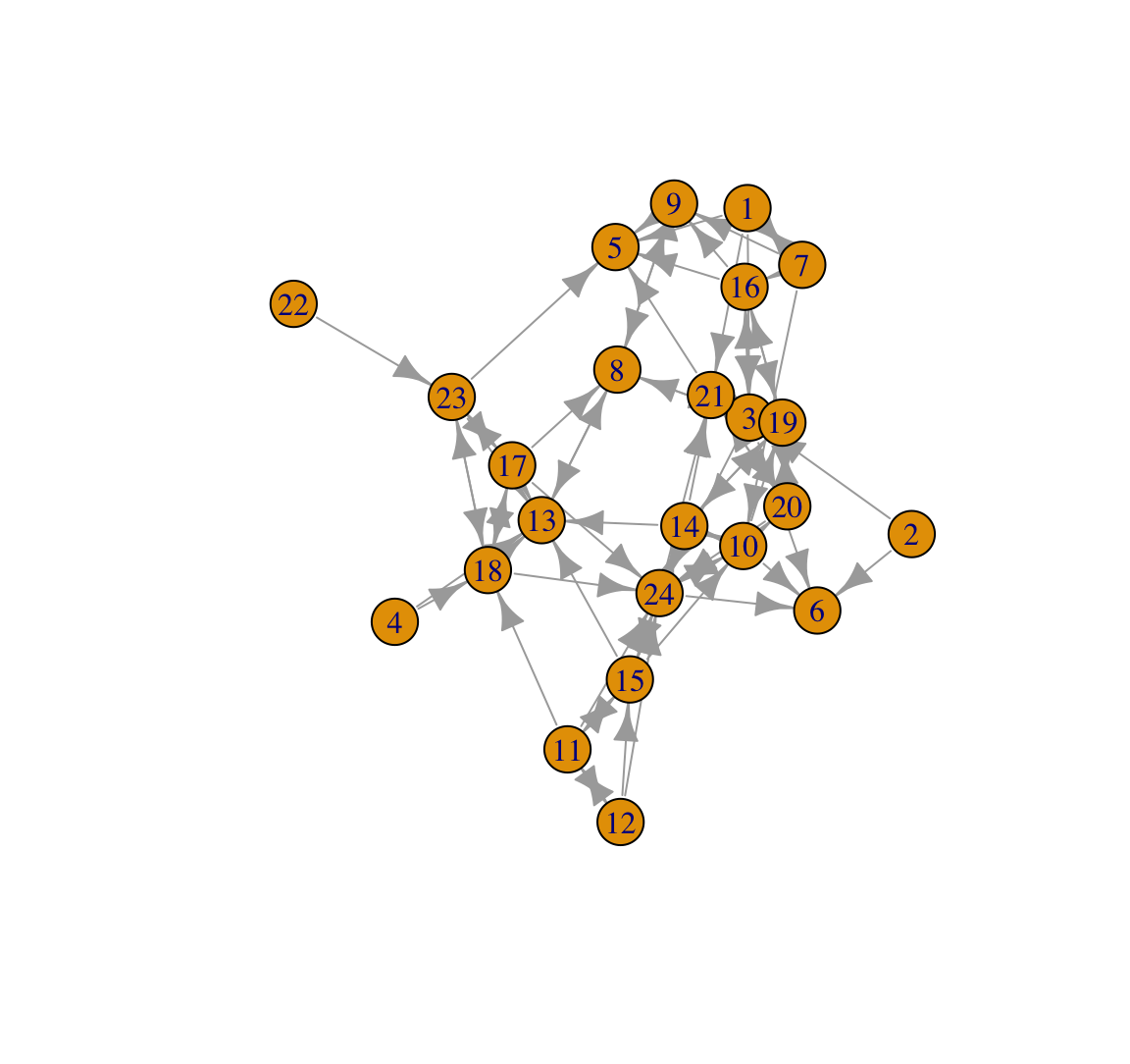
This plot looks okay but could be much improved visually. The plot also does not tell us anything about gender. Let's go ahead and color the nodes in a more meaningful way. We will color the nodes by gender, making boys navy blue and girls light sky blue. We will first create a vector denoting the desired color of each node.
cols <- ifelse(class_attributes$gender == "Female", "lightskyblue", "navy") We are using an ifelse() function to set color: light sky blue if gender equals Female, navy blue otherwise. Let's make sure that we coded this correctly using a simple table() function to look at color by gender.
table(cols, class_attributes$gender)##
## cols Female Male
## lightskyblue 16 0
## navy 0 8We now use a V(g)$color command to set the color of each node in the network (based on the colors defined in cols).
V(class_net)$color <- cols And now we plot as before.
plot(class_net)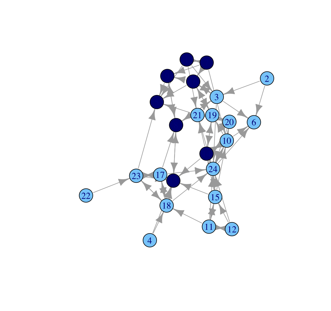
It is also possible to set the colors within the function itself using a vertex.color argument:
plot(class_net, vertex.color = cols)
Based on this plot we can see that the network does divide along gender lines, with one small group of boys and then a larger set of girls (who are divided amongst themselves). We also see that two boys are not part of the 'boy group', and are disproportionately connected to girls. A researcher may also be interested in which nodes receive the most nominations. For example, we may want to know if particular girls/boys are really important in the network. To make this easier to see, let's size the nodes by indegree, showing how many ties people send to them. Let's first calculate indegree for each node.
indeg <- degree(class_net, mode = "in")Now we plot the network and scale the size of the nodes by indegree, using a vertex.size argument. We set margin to -.10 to reduce some of the extra white space around the plot.
plot(class_net, vertex.size = indeg, margin = -.10)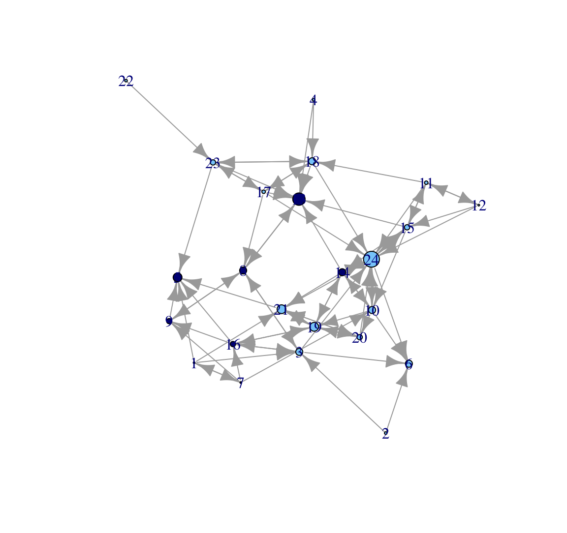
Here, we make all the nodes a little bigger (adding a 3 to indegree) but the nodes are still sized by indegree. We will also change the color of the labels to make them a little easier to read.
plot(class_net, vertex.size = indeg + 3, vertex.label.color = "red",
     margin = -.10)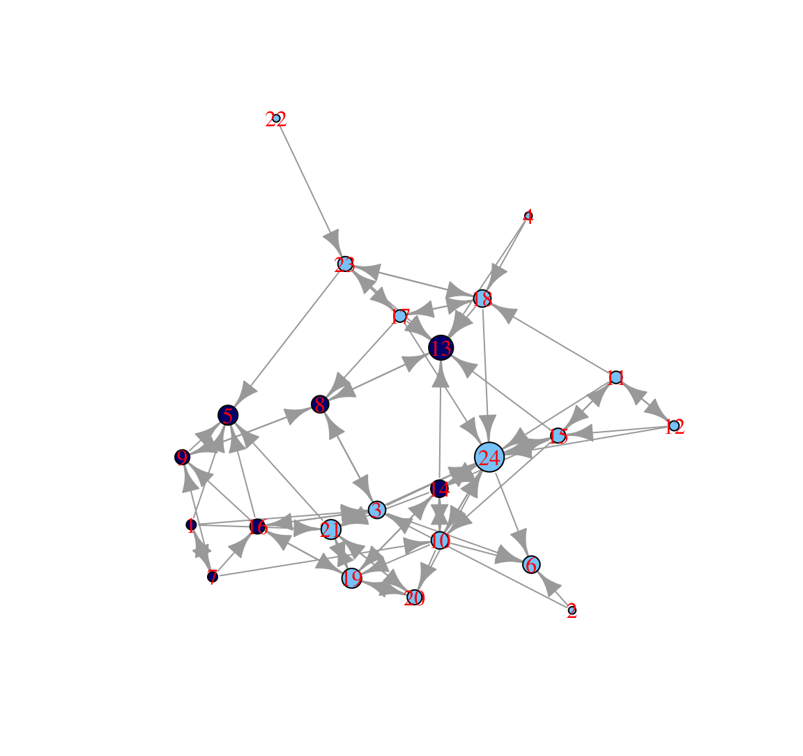
In this plot, nodes who receive a higher number of nominations are larger. We can see that one boy (id 13) and one girl (id 24) receive a particularly high number of nominations (perhaps they are high status nodes in different groups). We can also see that the boys in the 'boy group' tend to have low indegree, as they are only friends with each other and there are few boys in the network.
Let's go ahead and clean the plot up a bit to make it more visually appealing. This is important when producing figures for publications, websites, etc. We will start by changing the look of the nodes. Let's take out those labels using a vertex.label argument and take off the black edges around the nodes using a vertex.frame.color argument.
plot(class_net, vertex.size = indeg + 3, vertex.label = NA,
     vertex.frame.color = NA, margin = -.10)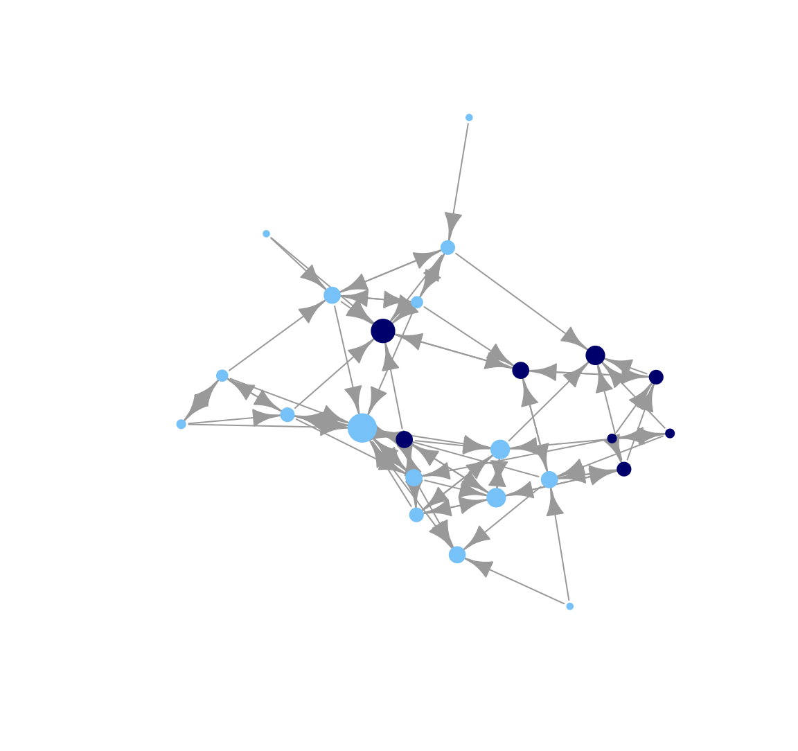
Here we change the look of the arrows on the edges. Let's make those arrows a little smaller using edge.arrow.size and edge.arrow.width arguments.
plot(class_net, vertex.size = indeg + 3, vertex.label = NA,
     vertex.frame.color = NA, edge.arrow.size = .5, edge.arrow.width = .75,
     margin = -.10)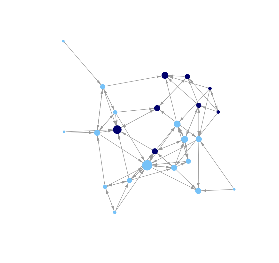
Now we change the look of the edges. Let's change the color of the lines to light gray (using edge.color). In general, making the edges a lighter color can help make network plots easier to interpret, especially when the network is large and/or dense. In this way, lighter edges help us avoid an unattractive 'hair ball' picture.
plot(class_net, vertex.size = indeg + 3, vertex.label = NA,
     vertex.frame.color = NA, edge.arrow.size = .5, edge.arrow.width = .75,
     edge.color = "light gray", margin = -.10)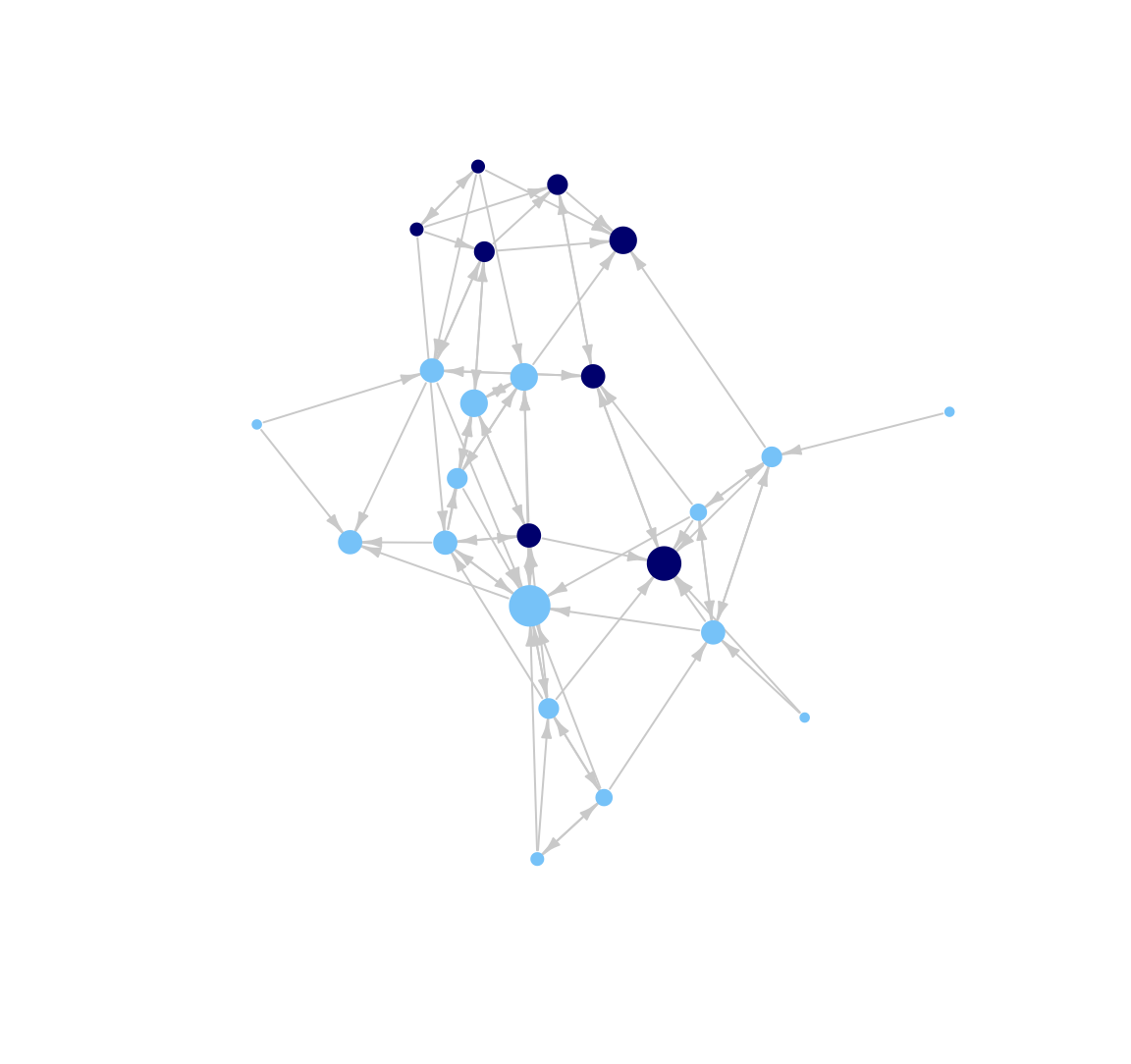
It is also possible to alter the layout of the plot. The default for igraph is to choose the 'best' layout function given the network, but we may want more control than that. For example, here we use an MDS-based layout.
plot(class_net, vertex.size = indeg + 3, vertex.label = NA,
     vertex.frame.color = NA, edge.arrow.size = .5, edge.arrow.width = .75,
     edge.color = "light gray", layout = layout_with_mds, margin = -.10)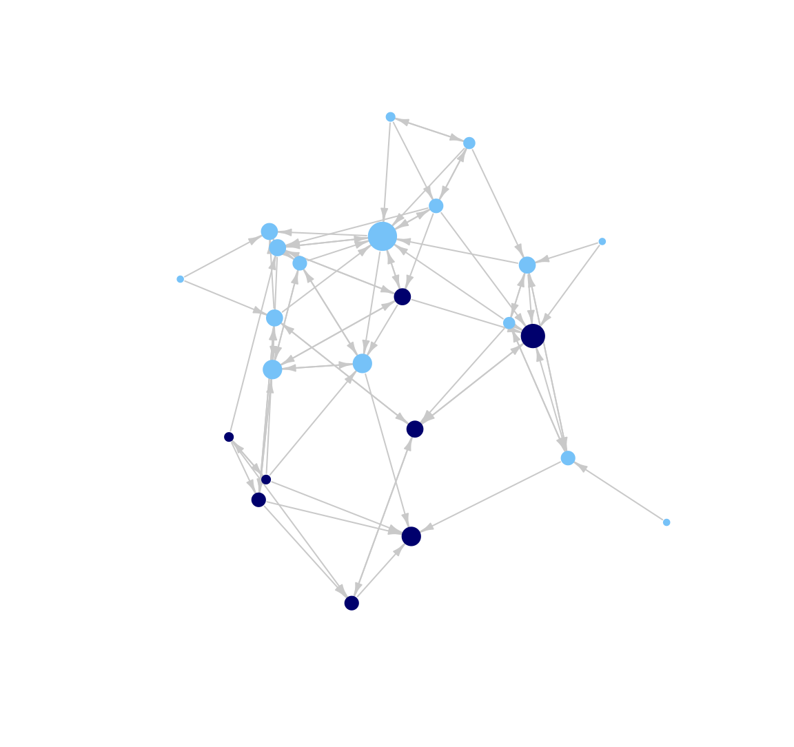
Or using an Kamada-Kawai layout:
plot(class_net, vertex.size = indeg + 3, vertex.label = NA,
     vertex.frame.color = NA, edge.arrow.size = .5, edge.arrow.width = .75,
     edge.color = "light gray", layout = layout_with_kk, margin = -.10)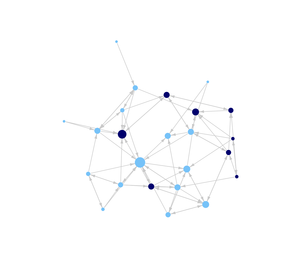
There are a number of other options a researcher could explore if they wanted to continue tweaking their plot. See the following help files for more options:
?plot.igraph
?igraph.plotting
5.3 Network Plots based on ggplot
There are a number of other packages in R that we can use to plot our network. Here we will explore some of the network tools based on ggplot. ggplot offers a very general way of approaching visualizations in R, offering a flexible set of visualization options. Here, we will see how to utilize this general approach to visualization for plotting networks. We will run through this relatively quickly, as we have already worked through one network plot in detail above.
ggplot uses network objects based on the network package format, so let's go ahead and detach igraph and load network and intergraph. Let's also load ggplot2 and GGally (a package for plotting networks using ggplot).
detach(package:igraph)
library(network)
library(intergraph)
library(ggplot2)
library(GGally)
And now let's construct a network object in the network format. Here we can rely on the intergraph package to transform the igraph object into a network object. The function is asNetwork().
class_net_sna <- asNetwork(class_net)Let's add our measure of indegree to the network object as a vertex attribute.
set.vertex.attribute(class_net_sna, attrname = "indeg", value = indeg)5.3.1 GGally package
Here we demonstrate how to plot networks using the function ggnet2() in the GGally package (Schloerke et al. 2021). The default plot is:
ggnet2(class_net_sna)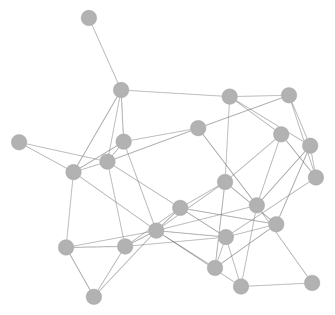
Let's add some options, including size of nodes (node.size), color of nodes (node.color), size of edges (edge.size), color of edges (color.edge), and size of arrows (arrow.size). As before, we size the nodes by indegree and color the nodes by gender (defined in cols). We also set the color of the edges to a light grey and include small arrows in the plot. It is important to note that the input values that work for one set of functions (i.e., igraph) may not be exactly the same as with other functions (ggnet2). It often requires a bit of testing to find the best set of values for the network in question.
ggnet2(class_net_sna, node.size = indeg, node.color = cols,
       edge.size = .5, arrow.size = 3, arrow.gap = 0.02,
       edge.color = "grey80")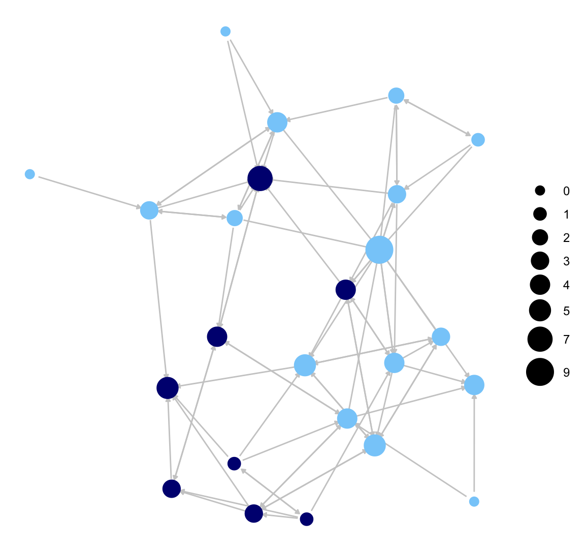
Here we do the same plot but take off the legend on node size. This is accomplished (using the logic of ggplot) by adding a + option and then a guides() function controlling the legend, here setting it off.
ggnet2(class_net_sna, node.size = indeg, node.color = cols,
       edge.size = .5, arrow.size = 3, arrow.gap = 0.02,
       edge.color = "grey80") +
  guides(size = "none")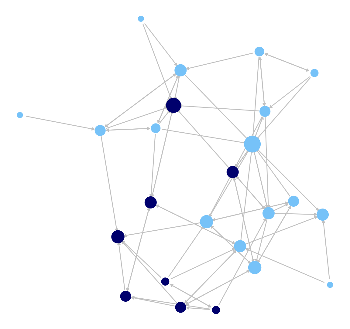
Now we will accomplish the same coloring of nodes, but this time we will use a vertex attribute on the network object (gender), setting the color in the palette argument (where male is set to navy and female to light sky blue). This will automatically create a legend for the node colors.
ggnet2(class_net_sna, node.size = indeg,  node.color = "gender",
       palette = c("Male" = "navy", "Female" = "lightskyblue"),
       edge.size = .5, arrow.size = 3, arrow.gap = 0.02,
       edge.color = "grey80") +
  guides(size = "none")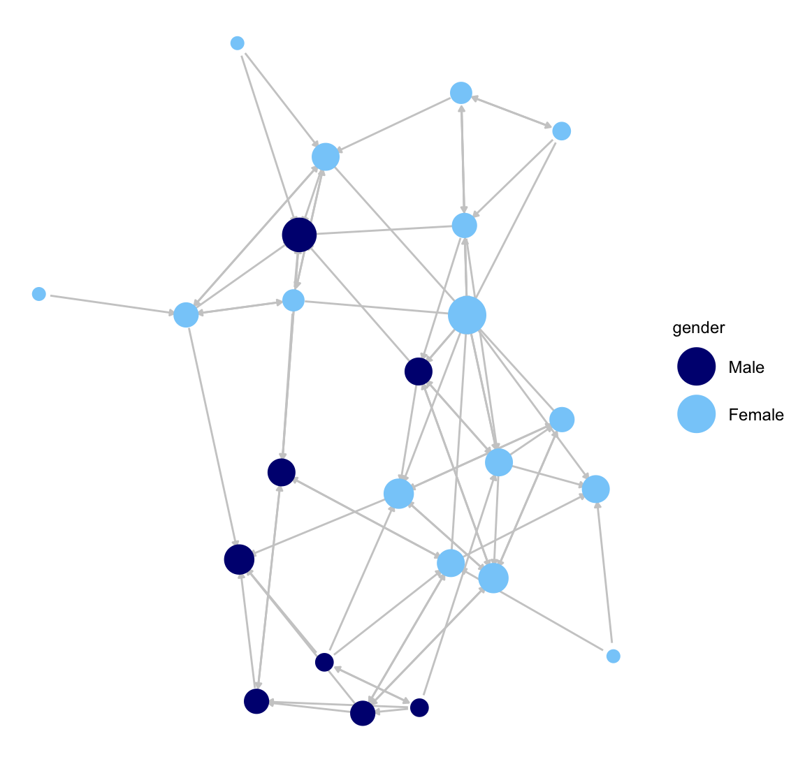
ggnet2() also makes it easy to color the edges in different ways. In this next plot, we will highlight the between and within gender ties. We will color all edges going from girls to girls light sky blue and all ties going from boys to boys navy blue. All girl-boy ties will be grey. This is accomplished by setting edge.color to c("color","grey80") with the first element telling ggnet2() to use the node colors to plot the edges (if they match) and the second element setting the color of cross-group ties.
ggnet2(class_net_sna,  node.size = indeg,  node.color = "gender",
       palette = c("Male" = "navy", "Female" = "lightskyblue"),
       edge.size = .5, arrow.size = 3, arrow.gap = 0.02,
       edge.color = c("color", "grey80")) +
  guides(size = "none")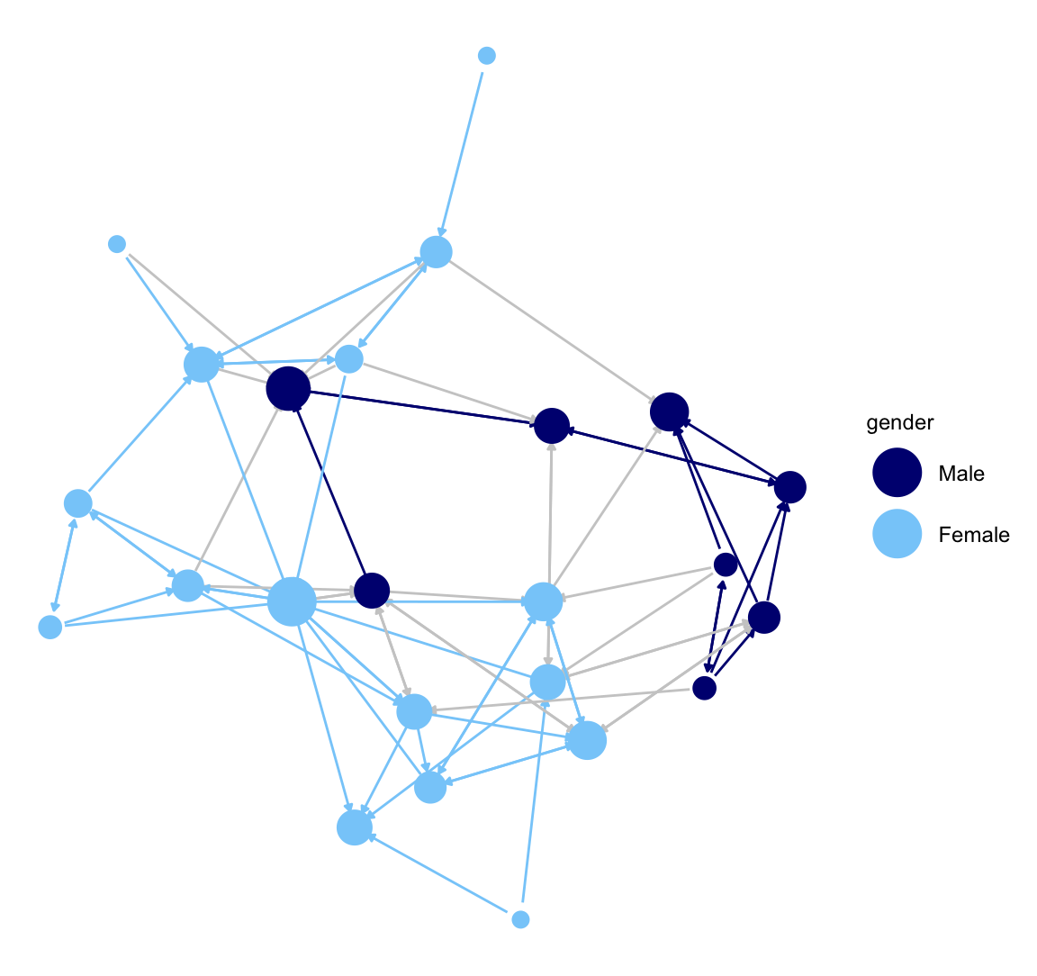
5.3.2 ggnetwork package
Here we offer a very short demonstration using the ggnetwork package (Briatte 2023). ggnetwork accomplishes similar tasks as ggnet2(), but requires the user to more directly rely on the ggplot functionality, which is useful for researchers seeking a large amount of control over the plot.
library(ggnetwork) Let's recreate our network plot using the ggplot() function. ggplot() works by adding each desired feature (or layer) to the plot. Beyond the network itself, we add an aes() (aesthetic) function to set the location of the nodes, a geom_edges function() to set the features of the edges, a geom_nodes() function to set the features of the nodes and the theme_blank() function to set the background to blank.
ggplot(class_net_sna, aes(x = x, y = y, xend = xend, yend = yend)) +
  geom_edges(color = "lightgray") +
  geom_nodes(color = cols, size = indeg + 3) +
theme_blank() 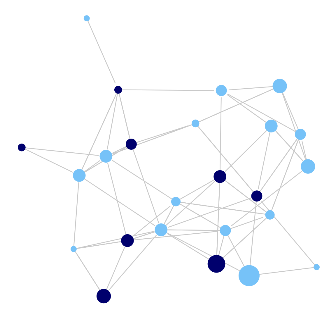
Now, let's do the same plot but add arrows to it, capturing direction.
 ggplot(class_net_sna, arrow.gap = .015,
        aes(x = x, y = y, xend = xend, yend = yend)) +
  geom_edges(color = "lightgray",
             arrow = arrow(length = unit(7.5, "pt"), type = "closed")) +
  geom_nodes(color = cols, size = indeg + 3) +
theme_blank() 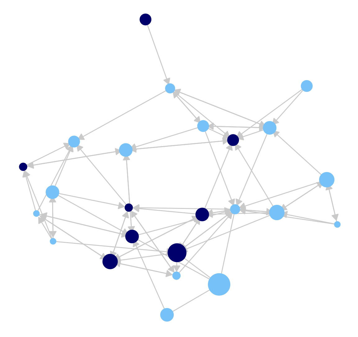
5.4 Contour Plots
As another example, we will use ggplot() to produce contour plots of our network. Countour plots offer a topographical representation of the network, especially useful for very large and very dense networks. We will use the same basic ggplot() function as above to plot the network, while layering a topography on top which reflects the density of different regions of the network. This is accomplished by adding a geom_density_2d() function to the ggplot call.
  ggplot(class_net_sna, arrow.gap = .01,
         aes(x = x, y = y, xend = xend, yend = yend)) +
  geom_edges(color = "lightgray",
             arrow = arrow(length = unit(5, "pt"), type = "closed")) +
  geom_nodes(color = cols) +
  theme_blank() +
  geom_density_2d()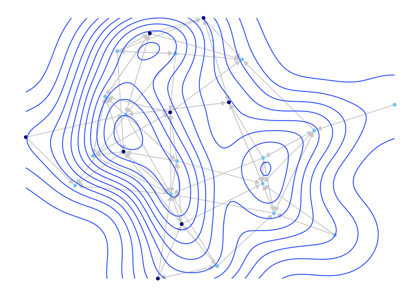
We can see that we have the same kind of network plot as before, but with a topography layered on top.
5.5 Interactive Plots
We end the first part of this tutorial by looking at interactive network plots. Interactive network plots offer a more 'hands-on' experience, where the user can highlight certain nodes, rotate the graph, change the layout, etc. directly on the plot. This can be particularly useful when initially exploring the features of the network. It is also a natural way of presenting a network on a website.
Here we will make use of the networkD3 package.
library(networkD3)The networkD3 package indexes the nodes starting from 0 (rather than 1) so we need to create an edgelist and attribute file that starts the ids with 0. Here we grab the sender and receiver columns from the original edgelist and subtract 1 from the ids.
class_edges_zeroindex <- class_edges[, c("sender", "receiver")] - 1And let's also create a new attribute file. We will subtract 1 from the ids. We will also include gender and indeg, as a means of coloring and sizing the nodes.
class_attributes_zeroindex <- data.frame(id = class_attributes$id - 1,
                                         indeg = indeg,
                                         gender = class_attributes$gender)
We are now ready to create a simple interactive plot. The main function is forceNetwork(). There are many possible arguments but we will focus on the main ones:
- Links = edgelist of interest
- Nodes = attribute file
- Source = name of variable on edgelist denoting sender of tie
- Target = name of variable on edgelist denoting receiver of tie
- Group = 'group' of each node, either based on an attribute or network-based group
- Nodesize = name of variable on attribute file to size nodes by
- NodeID = name of variable on attribute file showing id/name of node
Here, we use the edgelist and attribute file constructed above. We use gender as the grouping variable and set the size of the nodes by indegree (indeg).
forceNetwork(Links = class_edges_zeroindex,
             Nodes = class_attributes_zeroindex,
             Source = "sender", Target = "receiver",
             Group = "gender", Nodesize = "indeg", NodeID = "id",
             opacity = 0.9, bounded = FALSE, opacityNoHover = .2)
This function creates an html file that can be opened by a normal web browser (like Google Chrome or Firefox). Note that you can hover over desired nodes, change the layout, highlight certain edges, and so on, as a way of exploring different aspects of the network.
5.6 Dynamic Network Visualizations
We now shift our attention to visualizing dynamic network data, specifically the case of continuous-time, streaming data. Here, we are working with data that is time-stamped (or at least continuously recorded), capturing the interactions between actors in the setting of interest. We will work with the same data as in Chapter 3, Part 2. The data are based on recorded task and social interactions between students in a classroom (e.g., student i talked to student j who then talked to student k, and so on). Streaming data present a visualization challenge, as the researcher must decide on the proper range of interest. For example, if the time band is defined too narrowly, we might end up plotting an empty graph, with no interactions happening in the range of interest.
5.6.1 Getting the Data Ready
Let's go ahead and read in the data. We will read in three files: an edge spells data frame, a vertex spells data frame and an attribute data frame. Let's start with the edge spells data frame.
url3 <- "https://github.com/JeffreyAlanSmith/Integrated_Network_Science/raw/master/data/example_edge_spells.csv"

edge_spells <- read.csv(file = url3)head(edge_spells)## start_time end_time send_col receive_col
## 1 0.143 0.143 11 2
## 2 0.286 0.286 2 11
## 3 0.429 0.429 2 5
## 4 0.571 0.571 5 2
## 5 0.714 0.714 9 8
## 6 0.857 0.857 8 9The edge spells data frame captures the interactions occurring in the classroom. There is a column for start_time (when the interaction started), end_time (when the interaction ended), send_col (who initiated the interaction), and receive_col (who was the 'receiver' of the interaction). In this case the start and end time of the interaction are set to be the same, as interactions were short.
And now we read in the vertex spells data frame:
url4 <- "https://github.com/JeffreyAlanSmith/Integrated_Network_Science/raw/master/data/example_vertex_spells.csv"

vertex_spells <- read.csv(file = url4)head(vertex_spells)## start_time end_time id
## 1 0 43 1
## 2 0 43 2
## 3 0 43 3
## 4 0 43 4
## 5 0 43 5
## 6 0 43 6The vertex spells data frame captures the movement of nodes in and out of the network, determined by start_time and end_time. In this case all nodes were in the network for the entire period. Finally, we read in the attribute file (we use read.table as the file is saved as a tab-delimited file).
url5 <- "https://github.com/JeffreyAlanSmith/Integrated_Network_Science/raw/master/data/class_attributes.txt"

attributes_example2 <- read.table(file = url5, header = T)head(attributes_example2)## id gnd grd rce
## 1 1 2 10 4
## 2 2 2 10 3
## 3 3 2 10 3
## 4 4 2 10 3
## 5 5 2 10 3
## 6 6 1 10 4The data frame includes information for gender (gnd), grade (grd) and race (rce).
We will begin by constructing a networkDynamic object, based on the vertex spells and edge spells data frames. The networkDynamic object can then be used to produce plots and network movies.
library(networkDynamic)

net_dynamic_interactions <- networkDynamic(vertex.spells = vertex_spells,
                                           edge.spells = edge_spells)
5.6.2 Time Flattened Visualizations
The simplest visualization option is to collapse the streaming data into discrete networks and then use the same basic plotting strategies discussed above. This has the advantage of creating a simple visualization, while still capturing some aspects of over time change. The clear disadvantage is that we flatten, or lose, much of the dynamic information, which was the unique part of the data in the first place.
We will walk through an example of 'time flattened' visualizations before moving to more dynamic movies below. Let's create two discrete networks based on our interaction classroom data. The first network will capture interactions occurring in the first 20 minutes of class, while the second network will capture interactions in the last 20 minutes of class. Thus, an edge exists in the first network if i talked to j at least once between 0-19.999 minutes. An edge exists in the second network if i talked to j at least once between 20-39.999 minutes.
We can create these networks using the get.networks() function. The main inputs are the networkDynamic object, as well as the time periods to extract the network over. We set start to 0 and time.increment to 20, telling the function to extract networks (starting with period 0) at 20 minute increments.
extract_nets <- get.networks(net_dynamic_interactions, start = 0,
time.increment = 20)extract_nets## [[1]]
## Network attributes:
## vertices = 18
## directed = TRUE
## hyper = FALSE
## loops = FALSE
## multiple = FALSE
## bipartite = FALSE
## total edges= 42
## missing edges= 0
## non-missing edges= 42
##
## Vertex attribute names:
## vertex.names
##
## No edge attributes
##
## [[2]]
## Network attributes:
## vertices = 18
## directed = TRUE
## hyper = FALSE
## loops = FALSE
## multiple = FALSE
## bipartite = FALSE
## total edges= 34
## missing edges= 0
## non-missing edges= 34
##
## Vertex attribute names:
## vertex.names
##
## No edge attributesWe now have a list, with the first element corresponding to the network defined over the first 20 minutes (extract_nets[[1]]) and the second element corresponding to the network defined over the last 20 minutes (extract_nets[[2]]). Note that these networks are in the network (not igraph) format. As above, let's create a vector of colors to use in the plot. Again, we will color boys (equal to 1) navy blue and girls (equal to 2) light blue.
cols_example2 <- ifelse(attributes_example2$gnd == 2, "lightskyblue", "navy")Now we can go ahead and plot the networks. We want them side by side (accomplished using a par() function, setting mfrow to 1 row and 2 columns). Here we will use the default plot() function from the network package. We will set vertex.col (color of nodes) to the vector of colors defined above, and set vetex.cex (size of nodes) to 2.
par(mfrow = c(1, 2))

plot(extract_nets[[1]], main = "Talk to Network, 0 to 20 Minutes",
     vertex.col = cols_example2, vertex.cex = 2)

plot(extract_nets[[2]], main = "Talk to Network, 20 to 40 Minutes",
     vertex.col = cols_example2, vertex.cex = 2)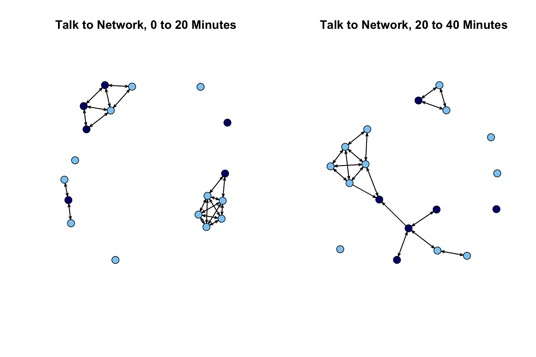
The plot looks okay but over time comparisons are complicated by the fact that the nodes are not placed in the same way in the first network as the second network. We will redo our plot but this time set the layout so it is the same across the two periods. We first use the network.layout.fruchtermanreingold() function to define the locations of the nodes. These locations are then used in the subsequent plot statements (set via coord). We define the locations of the nodes based on the period 1 network.
locs <- network.layout.fruchtermanreingold(extract_nets[[1]], layout.par = NULL)

par(mfrow = c(1, 2))

plot(extract_nets[[1]], main = "Talk to Network, 0 to 20 Minutes",
     vertex.col = cols, vertex.cex = 2, coord = locs)

plot(extract_nets[[2]], main="Talk to Network, 20 to 40 Minutes",
     vertex.col = cols, vertex.cex = 2, coord = locs)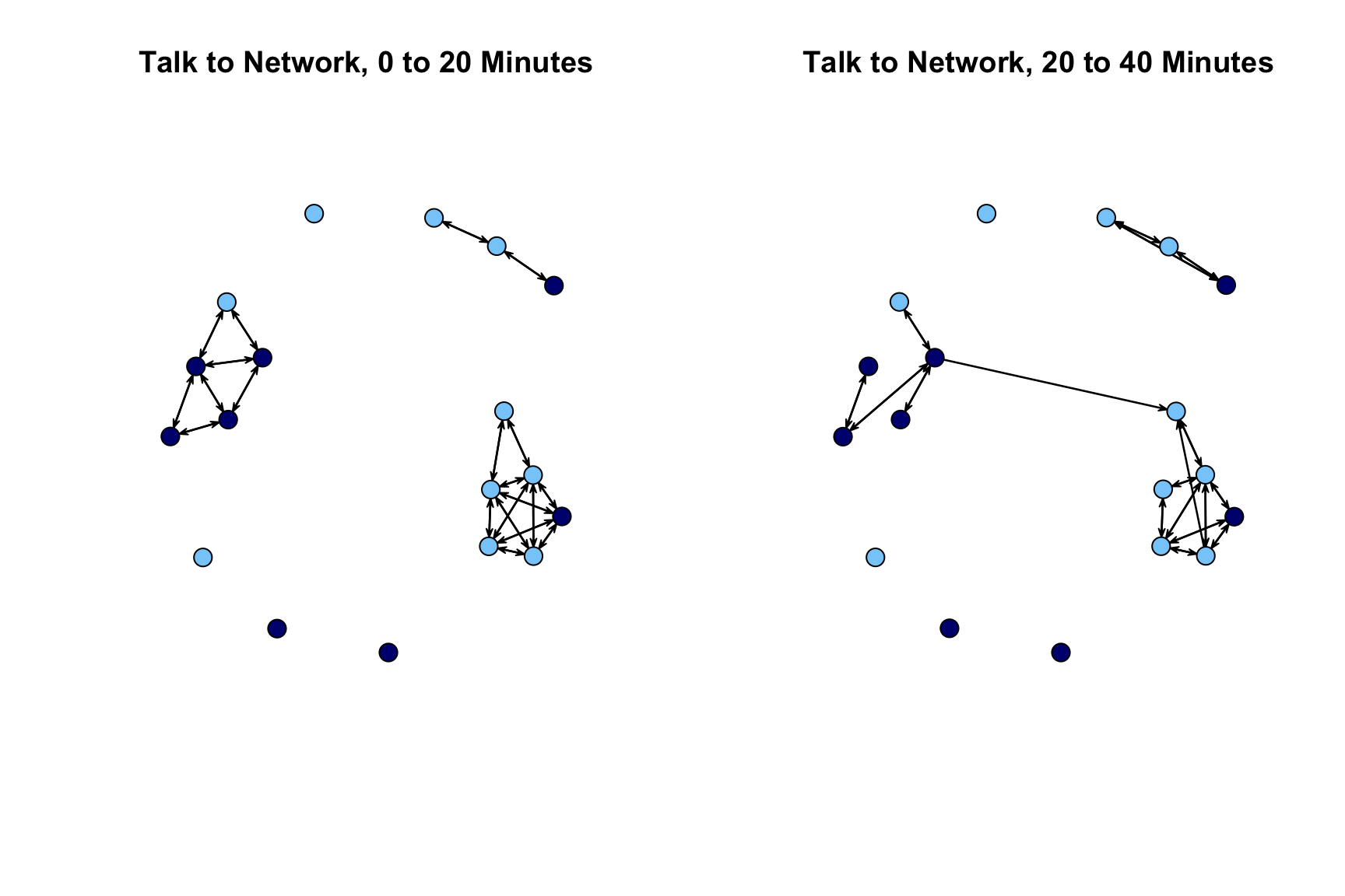
With this new layout, we can see that the first network splits into 3 groups, with no contact between them, while the second network has at least some (minimal) interaction between the two largest groups.
5.6.3 Dynamic Network Movies
We have so far considered time flattened visualizations of our continuous-time network data. It is also possible to take the dynamic network object and construct a movie of the network evolving over time. In this way, we are able to produce a streaming version of the network, while being able to control the level of aggregation for changes in edges and nodes. Here, we will make use of the functions in the ndtv package. The ndtv package (Bender-deMoll 2022) has a very large number of features allowing the researcher to make detailed, custom-made network movies. We only cover a small portion of the features of the package.
library(ndtv)We first need to set up the movie by creating a slice.par list that sets the basic features of the movie. The main arguments we need to set are:
- start = time in which to begin layouts for movie
- end = time to end layouts for movie
- interval = time between each layout
- aggregate.dur = duration which network should be aggregated
Here we will run the movie over the entire class period, create a layout at each minute and do no aggregation (setting aggregate.dur to 0). We first create a list of these features and then add it to the networkDynamic object.
slice.par <- list(start = 0, end = 43, interval = 1,
                  aggregate.dur = 0, rule = "latest")

set.network.attribute(net_dynamic_interactions, 'slice.par', slice.par)
We now are in a position to actually create the movie. It is often useful to save the movie out as an html file. The outputted movie can then be incorporated into websites or presentations. This is accomplished using the render.d3movie() function. In this case we set output.mode to "HTML" and set filename to the file we want to save out. Here we will save a file called classroom_movie1.html to the working directory. For convenience, we have also embedded the movie within this html file.
render.d3movie(net_dynamic_interactions, displaylabels = FALSE,
               vertex.cex = 1.5, output.mode = "HTML",
               filename = "classroom_movie1.html")
Looking at the movie, we can see that we get a slice every minute; but since we did not aggregate at all, we only get instantaneous interactions, so only those interactions happening at that exact minute. Given that most interactions do not happen on the minute exactly, much of this is null and not very interesting. So, let’s go ahead and change the slice.par list. Here, let’s set aggregate.dur to 1, so all interactions occurring within the minute are treated as happening in a given time slice (and thus layout). We will save this out as classroom_movie2.html.
slice.par <- list(start = 0, end = 43, interval = 1,
                  aggregate.dur = 1, rule = "latest")

set.network.attribute(net_dynamic_interactions, 'slice.par', slice.par)

render.d3movie(net_dynamic_interactions, displaylabels = FALSE,
               vertex.cex = 1.5, output.mode = "HTML",
               filename = "classroom_movie2.html")
We begin to see a bit more structure emerge, as reciprocity is now possible and prominent (where i talks to j and j talks to i), while this was not possible in the previous movie.
Here we will produce the same movie but color the nodes by gender (set using vertex.cols).
slice.par <- list(start = 0, end = 43, interval = 1,
                  aggregate.dur = 1, rule = "latest")

set.network.attribute(net_dynamic_interactions, 'slice.par', slice.par)

render.d3movie(net_dynamic_interactions, displaylabels = FALSE,
               vertex.cex = 1.5, vertex.col = cols,
               output.mode = "HTML", filename = "classroom_movie3.html")
We can aggregate even further and construct the movie based on a longer time range. Here we will aggregate over 10 minute time chucks (0-10, 10-20, 20-30, 30-40, 40-end). Thus, for the first slice, an edge exists between i and j if i talked to j in the first 10 minutes of class. This aggregation maintains some of the dynamic elements of the data while still capturing the larger structures that emerge in the network. The idea is that while we lose some of the dynamic time-stamped data (as every interaction within the threshold is treated the same, as a tie), we gain a bit more information on network features like distance and reachability, which are hard to capture when all interactions happen at unique time points.
slice.par <- list(start = 0, end = 43, interval = 10,
                  aggregate.dur = 10, rule = "latest")

set.network.attribute(net_dynamic_interactions, 'slice.par', slice.par)

render.d3movie(net_dynamic_interactions, displaylabels = FALSE,
               vertex.cex = 1.5, vertex.col = cols,
               output.mode = "HTML", filename = "classroom_movie4.html")
With this longer time period of aggregation, we begin to see groups emerge which was less possible when the aggregated intervals were only a minute. Finally, we can continue to use 10 minutes to aggregate the edges but set the interval to 1. In this case, rather than just doing 0-10, 10-20, 20-30, 30-40, the movie will do 0-10, 1-11, 2-12, etc. moving the interval up by 1 in each layout.
slice.par <- list(start = 0, end = 43, interval = 1,
                  aggregate.dur = 10, rule = "latest")

set.network.attribute(net_dynamic_interactions, 'slice.par', slice.par)

render.d3movie(net_dynamic_interactions, displaylabels = FALSE,
               vertex.cex = 1.5, vertex.col = cols,
               output.mode = "HTML", filename = "classroom_movie5.html")
Overall, this tutorial has offered an introduction to visualizing networks in R. We will draw on this syntax in nearly every tutorial to follow, including the next one (Chapter 6) on ego network data.